What Are the Four Stages of Data Visualization?
In 1869, Dmitri Mendeleev dreamed of a snake swallowing its tail. When he awoke, he sketched the first periodic table—a map of the elements that predicted undiscovered ones with eerie precision.
Today, we hunt a new element: data.
The Data Mines
Deep in server farms, “data miners” chip away at petabytes of raw information, just as 19th-century prospectors dug for gold.
The parallels are uncanny:
- Ore vs. Logs: Where miners found quartz veins, analysts uncover server logs.
- Smelting vs. Cleaning: Both processes remove impurities to reveal value.
Should Data Be Added to the Periodic Table?
The periodic table of elements, a cornerstone of scientific classification, systematically organizes the fundamental components of matter. However, in an era dominated by information, the question arises: Should data itself be considered an element? This paper examines the conceptual parallels between physical elements and data, arguing that data—like traditional elements—requires extraction, refinement, and structured representation to reveal its intrinsic value.
Drawing upon Khan’s (2014) four-stage framework for data visualization, we explore how raw data undergoes transformation into meaningful insight, akin to the alchemical processes that define elemental utility.
Since Mendeleev’s seminal formulation, the periodic table has served as a universal taxonomy for matter. Yet, the 21st century’s most valuable resource is no longer physical but informational. Data, often termed “the new oil,” shares key attributes with traditional elements:
- Abundance: Like hydrogen or oxygen, data permeates modern systems.
- Extraction: Data mining parallels the labor-intensive processes of elemental refinement.
- Economic Value: Both elements and data underpin technological and industrial progress.
This paper posits that data’s ontological status warrants reconsideration within a Mendeleevian framework.
We employ Khan’s (2014) four-stage model of data visualization (Acquire and process, Visualise, Interact, Retrieve) as a lens to analyze data’s “elemental” lifecycle. Comparative analysis with elemental properties (e.g., reactivity, conductivity) reveals functional overlaps.
Value: Earth Elements and Data
Both Earth elements and data share striking similarities in value and availability. The global market for elements like rare earth metals and commodities approximates $500 trillion, a figure mirrored by the burgeoning data economy.
Both require extraction—mining for elements, acquisition and processing for data—and exist in abundance, whether in the Earth’s crust or digital repositories. As highlighted in the slides under “Data vs Earth Elements,” this intrinsic value and abundance position data as a modern resource, ripe for analysis and visualization to unlock its potential.
Section I: Data
Data forms the foundation of visualization, akin to raw ore awaiting refinement. It exists in vast quantities—structured, unstructured, or semi-structured—waiting to be harnessed.
The slides emphasize data’s role as a starting point, a resource that, like Earth’s elements, holds latent meaning until processed. Without context, data is inert; its true power emerges through analysis and visualization.
Data Analysis
Data analysis bridges the gap between raw data and actionable insights, addressing inherent challenges along the way. The slides under “PATANALYSIS” identify key data problems: acquisition and processing, visualization, and retrieval. These steps involve collecting data, cleaning it, and preparing it for interpretation—a process akin to refining raw materials.
Analysis employs statistical methods, machine learning, and pattern recognition to distill meaning, setting the stage for visualization. As Morgan et al. (2022) note in the context of AI, adaptive algorithms in data-driven systems enhance this process, ensuring accuracy and relevance.
Visualization
Visualization transforms analyzed data into a comprehensible form, revealing “the truth” as stated on slide 12: “Visualization reveals the truth.” The slides present two frameworks for this process: the seven stages of visualization by Ben Fry (2008) and the condensed four stages by Khan (2014).
The Seven Stages of Visualization
Ben Fry’s framework, cited as Fry, B. (2008), outlines seven stages:
acquire → parse → filter → mine → represent → refine → interact. These steps encompass the full lifecycle of visualization—gathering data, structuring it, removing noise, extracting insights, designing representations, polishing them, and enabling user interaction.
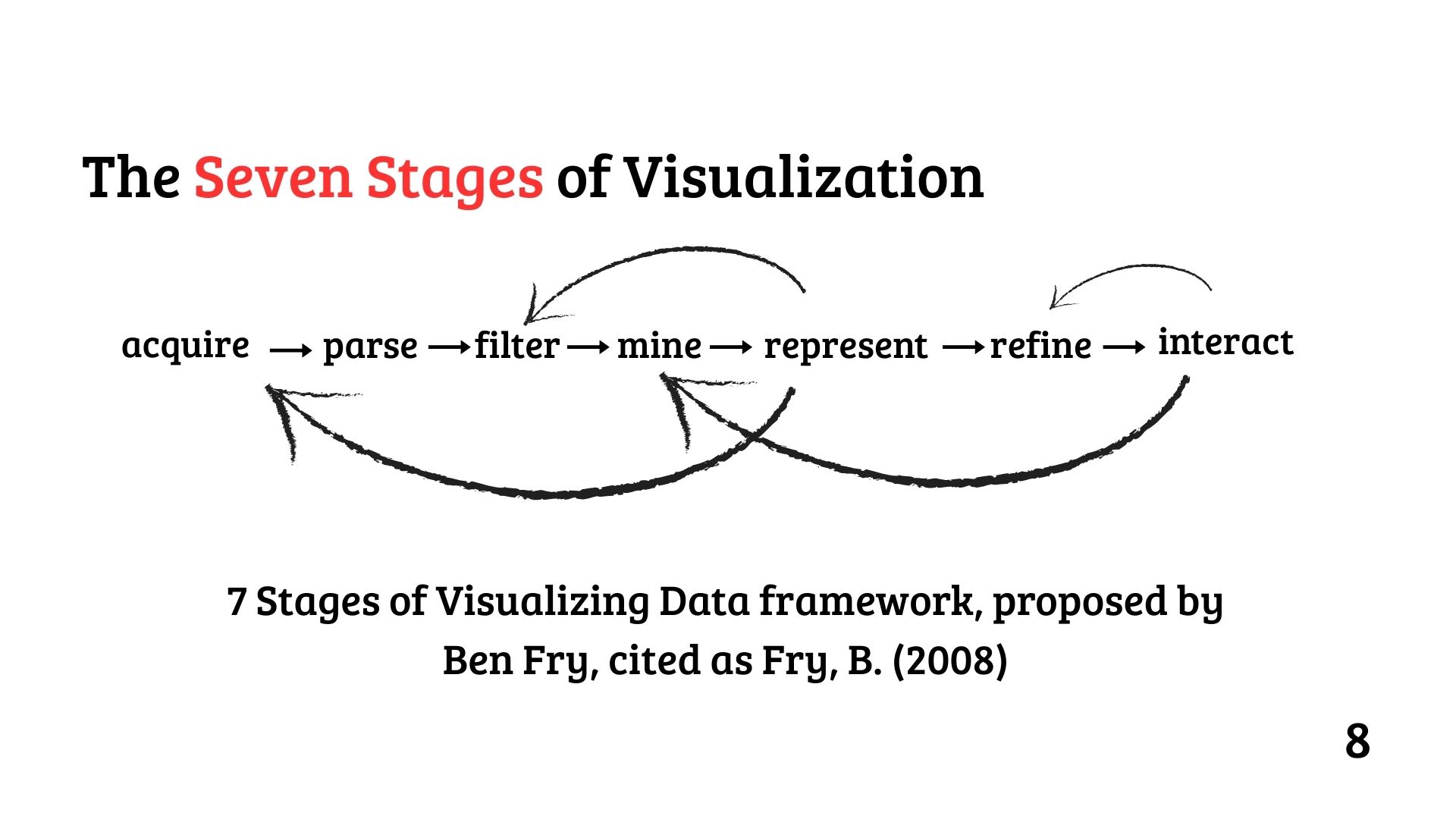 Figure 1: Fry’s 7 Stages of Visualization - A detailed lifecycle of data visualization as proposed by Ben Fry (2008).
Slide 9 notes an overlap in these stages (highlighted in red), suggesting that parsing, filtering, and mining often blend in practice, a nuance debated in Khan’s thesis.
The Four Stages of Data Visualization
Khan (2014) simplifies this into four stages:
Acquire and Process → Visualize → Interact → Retrieve.
This framework, detailed in “The Four Stages of Data Visualization” (slide 10), consolidates Fry’s steps for efficiency. “Acquire and Process” combines data collection and preparation; “Visualize” focuses on crafting representations; “Interact” allows users to explore the visualization; and “Retrieve” ensures data can be accessed for future use.
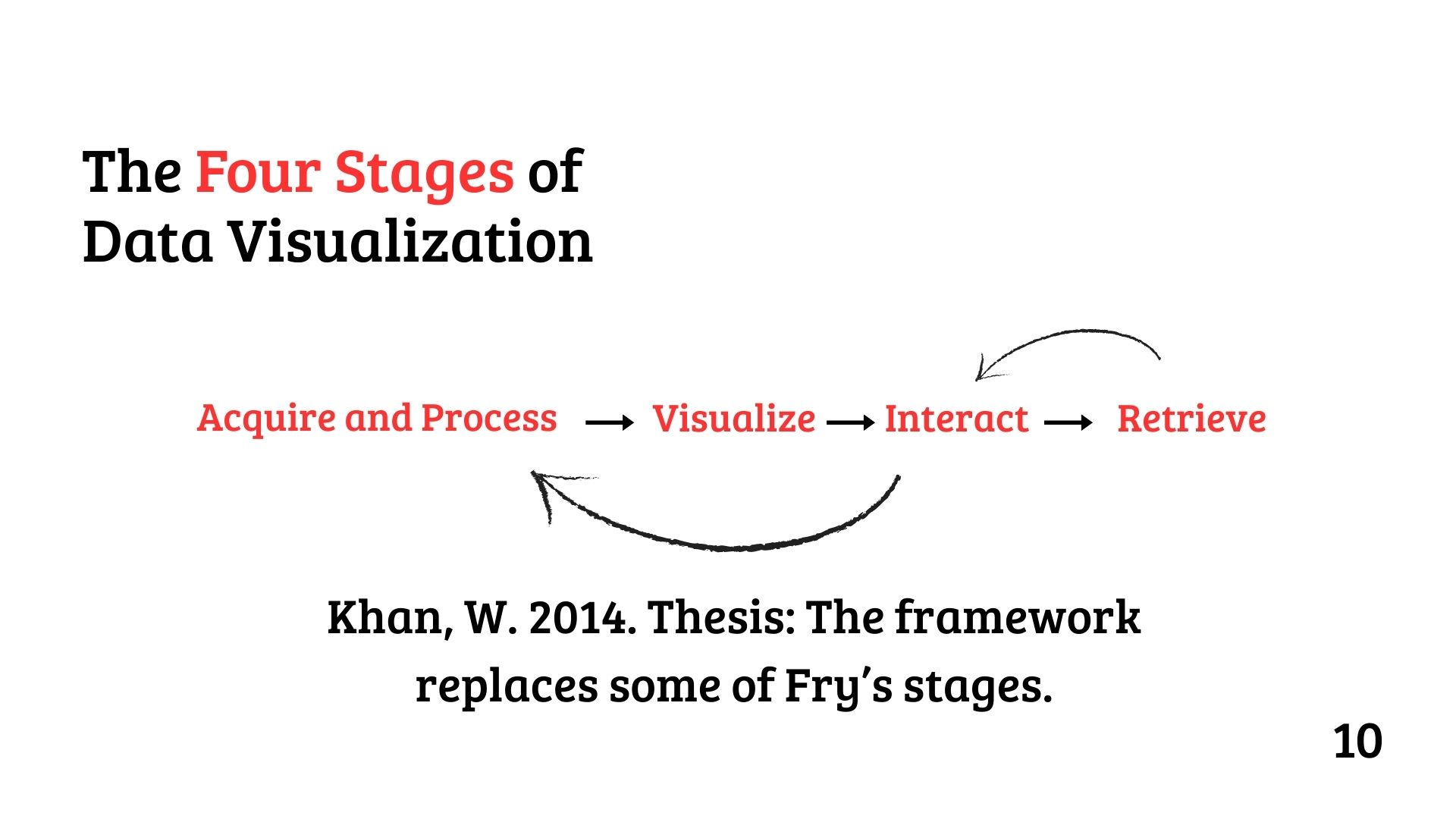 Figure 2: Khan’s 4 Stages of Visualization - A streamlined framework for transforming data into insights, proposed by Khan (2014).
Khan’s approach, rooted in his 2014 PhD thesis, emphasizes practicality, as seen in his “linked data visualisation” method using UK postcode data and Google Maps (slide 14).
Tools and Techniques
Slide 15 compares visualization tools like Power BI and Tableau, which dominate with a 36% market share. These platforms support diverse chart types—bar, pie, scatter, maps—categorized into comparison, composition, distribution, relationship, and geo/temporal visualizations.
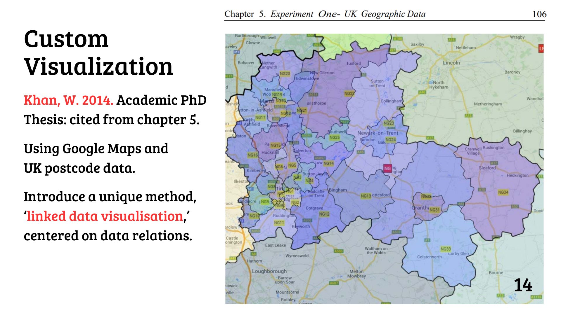 Figure 3: Khan’s Linked Data Visualization - An innovative method using UK postcode data and Google Maps to highlight data relationships (Khan, 2014).
This versatility aligns with Khan’s framework, enabling users to acquire, process, visualize, and interact with data seamlessly, much like the periodic table’s structured insights.
UK Geographic Data
Khan’s thesis (slide 14) introduces “linked data visualisation,” a unique method leveraging Google Maps and UK postcode data. This approach emphasizes data relations, mirroring the periodic table’s relational structure, and demonstrates how visualization can uncover geographic patterns—akin to elemental properties—driving innovation in urban planning and beyond.
Conclusion
Data, like Earth’s elements, holds transformative potential when structured and visualized. The periodic table exemplifies how layout reveals patterns, a principle echoed in data visualization. Khan’s four stages—Acquire and Process, Visualize, Interact, Retrieve—offer a streamlined path to extract meaning, supported by tools like Power BI and Tableau.
As slide 16 predicts, AI and data scientists will continue to shape this field, with visualization remaining the key to unlocking data’s truth. Just as the periodic table revolutionized chemistry, data visualization is redefining our understanding of the digital world.
Downloads
- Dr Wajid Khan Data Talk PPTx
- Portfolio Score Sheet for TedTalk Comp. A .doc
- Figma Template
- Canva Template
References
- Fry, B. (2008). Visualizing Data. O’Reilly Media.
- Khan, W. (2014). Academic PhD Thesis. Cited from Chapter 5.
